Plotting
With a couple of practical examples, we will discover tips on how to generate a plot, and outline the various plotting methods and format styles you can explore.
Info
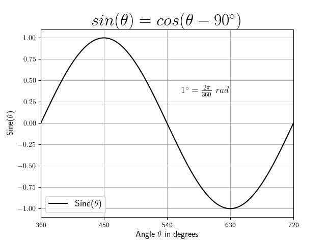
If you're interested in the creation of the sine-graph above, you can find the code
below. Note, for the data generation the numpy package is used as well as the matplotlib package for data visualization.
We will cover some of the used functionalities and formatting styles in this section.
Create Visualization
# import packages
import numpy as np
import matplotlib.pyplot as plt

# Definition of variables
phi_min = 0                # definition of starting angle in degrees
phi_max = 360              # definition of final angle in degrees
n = 100                    # number of points

# Calculations and data generation with numpy
# Gererate time-vector
t = np.linspace(np.radians(phi_min), np.radians(phi_max), n, endpoint=True)
y = np.sin(t)

# Visualization with matplotlib
plt.rcParams['text.usetex'] = False    # if True use LATEX font type

plt.figure()
plt.plot(t, y, 'k')

# Labels for the x- and y-axis
plt.xlabel(r'Angle $\theta$ in degrees', fontsize=12)
plt.ylabel(r'Sine($\theta$)', fontsize=12)

# Change axes
startx, endx = np.radians(phi_min), np.radians(phi_max)
starty, endy = -1.1, 1.1
plt.axis([startx, endx, starty, endy])

# Add grid
plt.grid()

# Change scale of axes
ax = plt.gca()
axis_x = np.array([0, 90, 180, 270, 360])
axis_x = np.radians(axis_x)
plt.xticks(axis_x, [360, 450, 540, 630, 720])

# Add legend
ax.legend([r"Sine($\theta$)"], loc="lower left", fontsize=13)

# Add title
plt.title(r"$sin(\theta) = cos(\theta - 90^\circ)$", fontsize=24)

# Add text using x- and y-coordinates
plt.text(3.5, 0.35, r'$1^\circ=\frac{2\pi}{360}~rad$', fontsize=13)

# Show graph
plt.show()
Introduction
Info
We will give a brief introduction on plotting data with pandas, which is built on the package matplotlib(the corresponding documentation is available here).
This chapter is an extension to the previous pandas
chapter. Therefore, we will use the Spotify data set and we assume that you have imported the data already (to download the data set and reading the file see pandas).
This chapter should equip you with the necessary skills to generate various visualizations for your data analysis.
Getting started
First, install matplotlib as it is required for pandas' plotting
functionalities. Additionally, you can use matplotlib to customize your
figures, but more on that later. Import both packages to start plotting.
2-D plots
Figures can be generated directly using a DataFrame. Simply call its plot()
method. The x and y attributes refer to the values of the x and
y-axis.
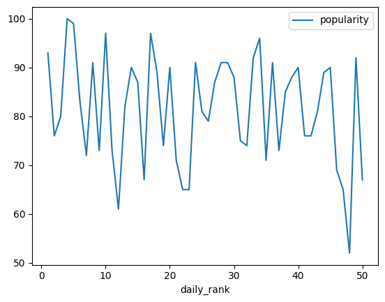
If you visualize a DataFrame, you plot all columns as multiple lines. If the
x values are not explicitly stated, the index of the DataFrame is
utilized. In our case, the index and hence the x-values start with zero and
end with the number of rows minus one (range(0, number of rows)).
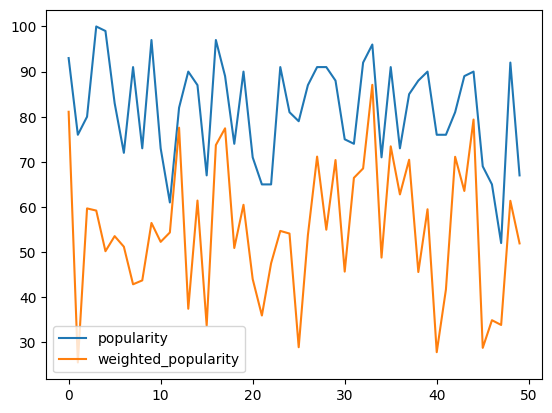
# Mathematical operations (see pandas)
data["weighted_popularity"] = data["popularity"].mul(data["energy"])
data_plot = data[['popularity', 'weighted_popularity']]
data_plot.plot()
Note: The plt.show() function in a py script opens one or more interactive windows to show the graphs. For jupyter notebooks the command is not necessary because the graph is enbedded in the document.
Formatting
pandas offers a a range of pre-configured plotting styles. You can use plot style arguments to perform format changes by simply adding it to the plot function. There are some common plot arguments that are worth mentioning (for more detail see also the pandas documentation or Google.):
style: Color and style of lines or markers (see table below).linewidth: Changing thickness of the line.legend: Description of the elements in a plot (locfor the location usingplt.legend()).grid: Adding a grid.xlabel,ylabel: Labeling the x- and y-axis.xticks,yticks: Changig the annotation of the axis.axis: Changing the range of the axis (xlim,ylimindividually).secondary_y: Adding additional plot.subplots: Generating individual plots for each column (layoutfor thesubplots).title: Adding a title (setfontsize).figsize: Changing the size of the plot.
The following table shows additional arguments for different colors, line styles and marker types.
| Initials | Description | Initials | Description | Initials | Description |
|---|---|---|---|---|---|
y |
yellow | - |
solid line | + |
plus-marker |
m |
magenta | -- |
dashed | o |
circle |
c |
cyan | : |
dotted | * |
asterisk |
r |
red | -. |
dotdashed | . |
point |
g |
green | x |
cross | ||
b |
blue | s |
square | ||
w |
white | d |
diamant | ||
k |
black | >, <, ^, v |
triangle |
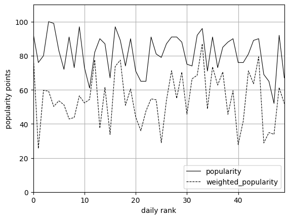
MCI | WING: Formatting standards
Info
For laboratory reports and final papers formatting standards exist (see Academic Walkthrough - Formakriterien für schrifliche Abgaben - Abbildungen und Diagramme).
For example:
- The line colors are usually set to black or gray with different line styles for black/white printing.
- The legend is necessary to identify different data series in one graph.
- For axis labelling the following information is mandatory: the variable name and unit.
data_plot.plot(style=['k-','k--'], xlim = (0,49), ylim=(0, 110), linewidth=0.8,
               grid=True, xlabel='daily rank', ylabel='popularity points')
plt.legend(loc='lower right')
Formatting line plots
We want to analyse the tempo of our tracks.
Generate a line plot of the tempo (y argument) and the daily_rank as the horizontal axis (x argument).
Change the format to the following:
- Set the line color to black
- Delete the legend (hint: set legend to
False) - Set the labels of the x- and y-axis
- Set the range of the x-axis from 1 to 50
Statistical plots
pandas supports statistical plots, which present results of the statistical data analysis.
The following table shows some of these plotting methods, which are provided with the kind argument in the plot() function or using the mehod DataFrame.plot.<kind> instead.
| Initials | Description |
|---|---|
hist |
histogram (bins change number, density for probability?) |
scatter |
scatter plot (two variables representing the x- and y-values) |
bar |
bar plot for labeled, not time-series data (stacked for multiple bars/columns) |
barh |
horizontal bar plots (also used for gantt charts) |
box |
boxplot shows distribution of values within each column (by for grouping) |
kde, density |
density plot |
area |
area plot |
pie |
pie chart (percent of categorical data) |
Some of the formatting arguments can be used for statistical plots. For a detailed description see the pandasdocumentation.
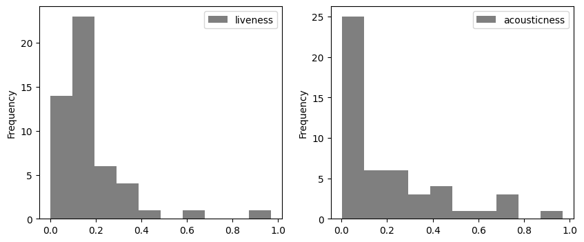
Histogram
The histogram counts the number of values in each bin. The range of the bin and the number of bins can be changed using the range and bins argument. Histograms of multiple columns can be drawn at once using subplots.
data_plot = data[['liveness', 'acousticness']]
data[['liveness', 'acousticness']].plot(kind='hist', layout=(1,2), figsize=(10, 4), subplots=True,
                                        color='k', alpha=0.5)
Change arguments
Make the following changes to the histogram above and see what happens.
- Generate a probability density function (hint: use the argument
density). - Add the argument
binsand change the number of bins to 20.
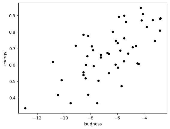
Scatter plot
The scatter plot can be used to show correlations between two variables. Therefore, the horizontal (x argument) and vertical (y argument) coordinates are defined by two columns of the DataFrame.
Scatter plot
Generate a scatter plot to show, if there is a relationship between the variabel speechinessand the variable tempo.
Detour: Data categorisation for statistical analysis
Categorical data in pandas correspond to categorical variables in statistics. This data type has a limited number of possible values, which are called categories.
For example, some artists have more than one song in this list. The calculation of the maximum number of tracks one artist has, can be generated as follows.
number_artists = pd.Categorical(data['artists']).value_counts()
print(number_artists.max())
print(number_artists[number_artists == 3])
Let's break the example down:
- The datatype
Categoricalshows a list of unique artists (output: 46 different artists). - The method
value_counts()creates aSerieswith the number of counts for each artist. - The method
max()calculates the maximum number of tracks for one artist in the data set. - Lastly, we use boolean indexing to show the name of the artist.
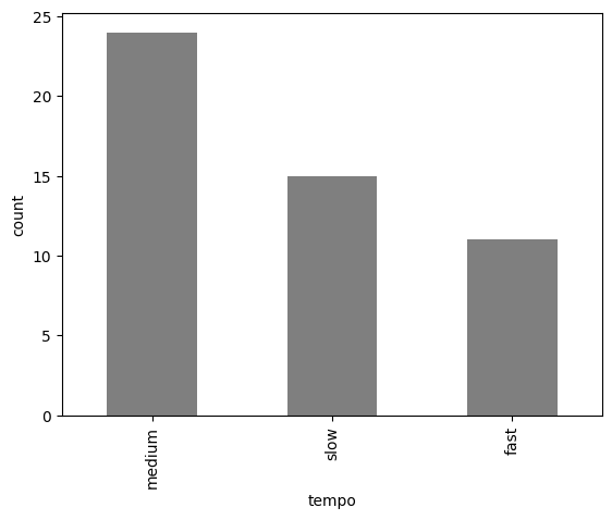
The cut() method discretizes data according to intervals (bins) and chosen names (labels).
The DataFrame can easily be extended by the Series with categorical data.
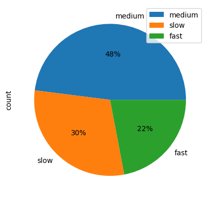
data['tempo_cat'] = pd.cut(x=data['tempo'], bins=[0, 110, 140, 200],
                           labels=['slow', 'medium', 'fast'])
Categorical data can be used for grouping in box plots, as we will see below.
Further we can generate a DataFrame which contains the different categories in the first column and the number of counts in the second column using the value_counts() method.
We will see, that this DataFrame can be used for statistical graphs like bar plots or pie charts.
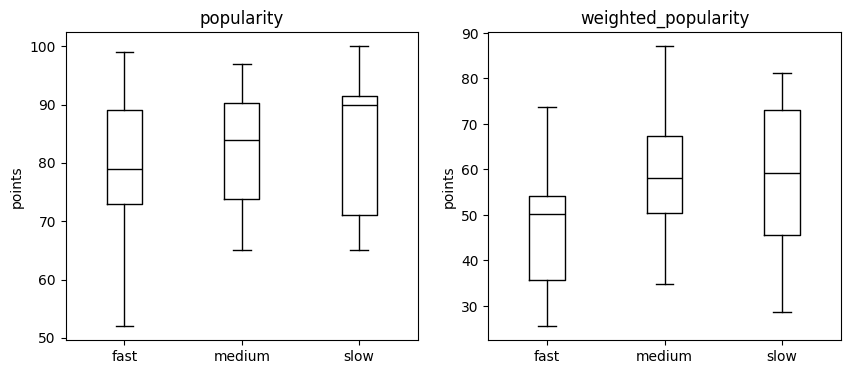
Box plot
The boxplot is generated to visualize the statistical values for each column of a DataFrame.
pandas also supports many arguments of the matplotlib package for boxplots (look at the matplotlib documentation).
data.plot.box(column=['popularity','weighted_popularity'], by='tempo_cat',
              color='k', ylabel='points', figsize=(10,4))
Box plot
Generate a box plot to show the difference between the variables acousticness, speechiness and liveness.
Bar plot
The bar plot presents rectangular bars, which represent the values of the DataFrame for different categories (x axis).
Pie chart
The pie chart shows the percentage of each category from the absolute values of the count table.
The different formatting styles for the pie chart can be done using the autopct argument (for more information see the matplotlib documentation).
Danceable tracks

We assume that tracks with a danceability score higher than 0.8
are most danceable and the tracks less than 0.7 are less danceable.
- Categorize the data using the categories
less_danceable,danceableandmost_danceable. - Generate a boxplot to explore the relationship between the
tempogrouped by the different categories fordanceability. - Display the number of tracks for each category in a
DataFrame(hint: use thevalue_counts()method). - Visualize the number of tracks for each category with a
barchart. - Visualize the number of tracks for each category in a
piechart.
Recap
We provided the basis to generate good looking visualization of your data analysis using pandas.
The introduced functionalities and arguments can be used to change the format of your graphs to your liking.